Project Overview:
In this case study I was the sole lead UX/UI Consultant and designer for Hill+Knowlton Strategies, an international PR company.
It was an engaging and challenging experience that involved collaborating with a team of highly skilled data scientists to bring into fruition a new advanced way of monitoring global campaigns.

The project aimed to elaborate on information from various publishers internationally, utilizing AI tactics to create metrics that demonstrate the effectiveness of brand campaigns. Initially, the project had already started without a UX/UI designer, and I joined the team to quickly catch up with the progress and contribute my expertise in the projects goals and bridge the gap between theory and metrics vs marketing, visuals, and branding from the designer perspective.
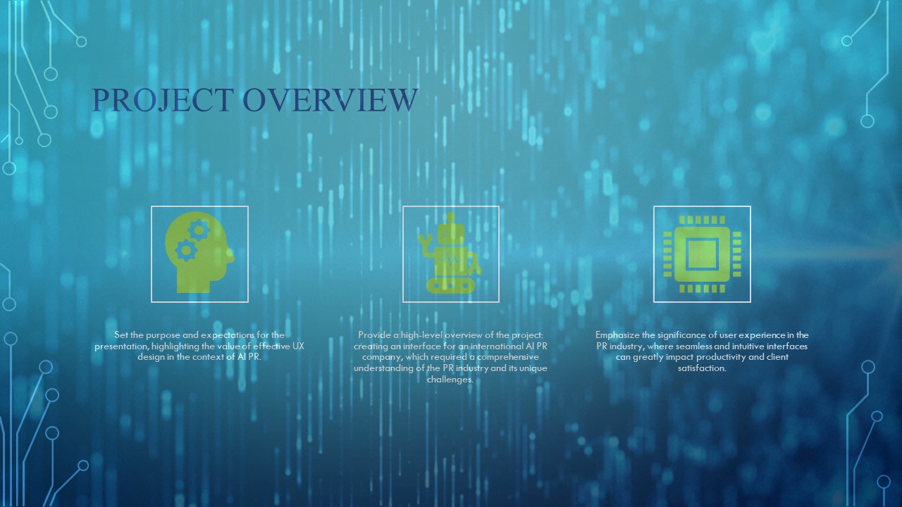
My main goal was to create a brand-new platform interface which can take the metrics created by the data scientists and standardize the data so we could apply it to multiple clients. Another aspect was the back end to create an internal system for the analysts themselves in which the inputs using AI would automatically fill out the templates with limited human hours.

Problem Definition:
One of the main challenges was the lack of a marketing perspective and user-centered design in the project’s early stages.
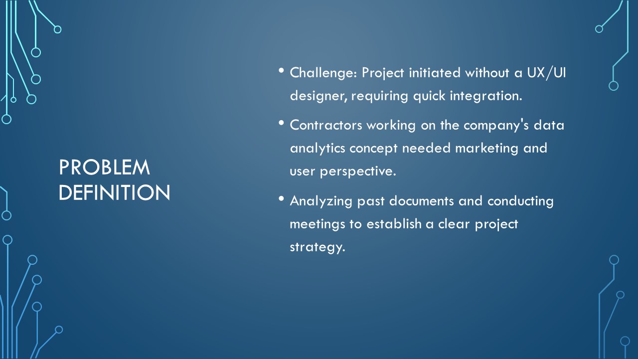
Within a tight 12-week deadline, we needed to establish a firm strategy and align our goals to ensure project success.

Research and Discovery:
To understand the project fully, I immersed myself in the language used by the data scientists, thoroughly reviewing their pre-existing documentation. I conducted numerous meetings with the team and interviewed analysts of various levels both Senior to Junior to gather insights on how campaigns were handled.

A large bulk of the research was taking time with the Managing Director and understanding her exact vision. Both in design aesthetics and function. What became clear is the company had analysts creating client projects in their own personal ways.
There was little standardization in pre-existing campaign powerpoints nor how metrics were created.

Design Process:
The design process involved analysing metrics, developing workflows, creating rough prototypes and designs, and refining them based on feedback and limitations of our chosen visual software Power of BI. I was told to focus on the client-facing side while considering internal needs, aiming to create a dashboard that met both requirements.

Like any other project once I had had communications with all the relevant people and compiled my notes as text and sketches. There was a need to create a timetable of what was getting done when due to the finite amount of time given for delivery.

It had become clear that this product had much scope for growth, but it was agreed that this would be the basic level of the product allowing for development if they so chose in the future.

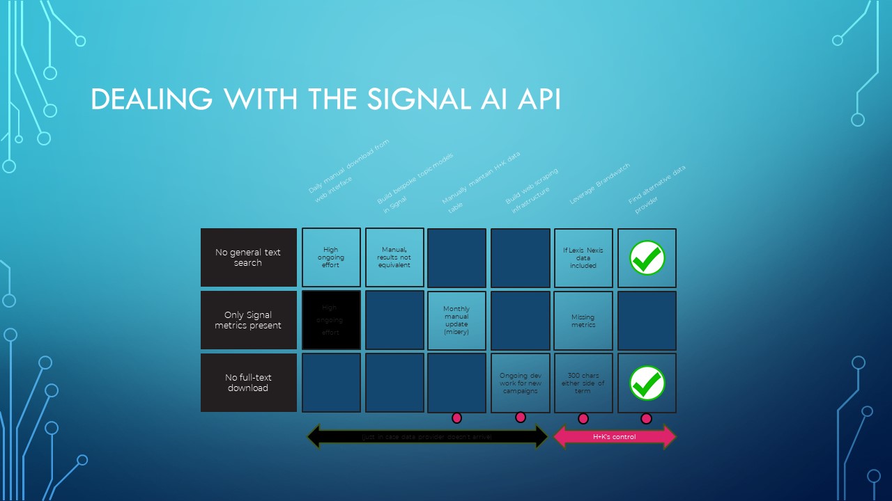
A large amount of the design relied on the metrics getting pulled through the API. This would dictate structures. The issue was most the metrics were not getting pulled through at the time nor was it understood which of those metrics was most important. This left a large number of assumptions in place which had to have solutions or alternatives if they did not work.
Design Decisions:
Design decisions were influenced by user conversations and input from experienced internal team members. Since it was an international large company, they did have a style standards but unfortunately they are due to do a rebrand later this year so I was left to make do in the situation.

So that all decisions made sense and everyone in the team understood exactly what is happening I had to create for us various workflows from both the data, Analyst, and client perspective as well as possible add Ons in the future. We implemented a tier packaging approach, allowing for a beta version of the dashboard to be presented to smaller clients while considering future iterations.

The hierarchy of the data was the most important and then understanding how the client may use what is called a smart media list to show insight and guidance in making the campaign as per the selections the analyst internally in the system had chosen. Throughout this product it was necessary for filtering of various kinds.
One request was to make this less Power BI looking in Power BI. We utilized various buttons and stripped-down design to give the feeling of it being more of an app than your standard rather dull power of BI chart dash.

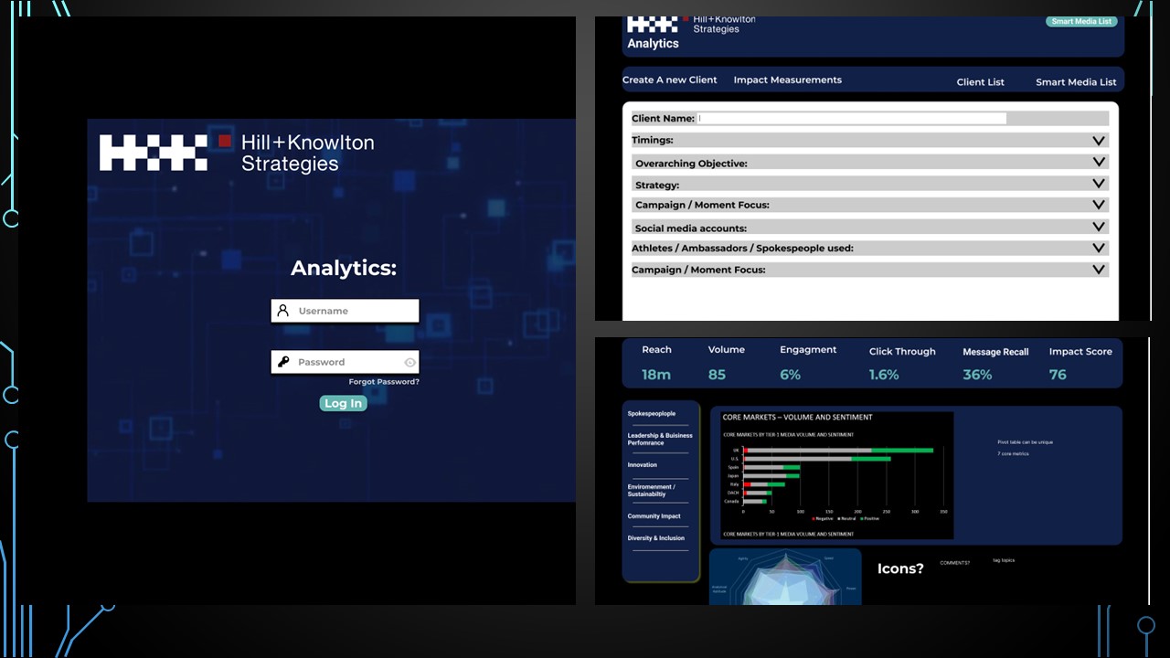
These images were the final result designs for front and back end:


Collaboration with Developers:
Collaboration with developers was essential to manage expectations and ensure a smooth workflow.

Constant dialogue and exchange of ideas between myself as the designer and developers helped shape the final product and was most imperative.

Here is a show of how we were using clusters based on an emotion and how it is identified in the various publications. The clusters signified relevant hitting points which can be used to inform future campaigns and understand past ones. This is a show of how the APIs were coming through from scraping the various publications online.

This was the general pipeline in relation to data science and where these metrics landed to be interpreted for design.


Here we have the whole workflow pipeline and on the right the analyst step by step workflow and how the pipeline integrated into the steps.

Measurement and Evaluation:
The metrics and KPIs were exceedingly tricky due to the way each client stakeholder were doing it differently. To make it simple we generally created a way to calculate everything to a number out of 100. This from a visual design perspective helped a lot as well as from a database management perspective.

The user testing was not given as much time as one maybe would have liked but due to the time and the fact that this was a beta in which the team of us consultants was to create and develop the project to a degree where it could be handed over internally and developed further there.

Results and Impact:
The company was extremely pleased with the outcome, and feedback from smaller clients indicated their
interest in subscribing to the product.

Our project positioned H+K as a leader in utilizing AI-inspected data, paving the way for further development and exploration. It has opened doors for the business to stay ahead of competitors and utilize the analysts time in more constructive ways. Not only this but we have successfully given the blueprints for the company themselves to develop their project on a tier basis client to client with an intact UX/ UI pipeline already in place.

Conclusion:
In conclusion, this project provided an exciting opportunity to solve problems and enhance
communication through UX/UI design.
Despite the time constraints, we successfully delivered a product that met the requirements and established a foundation for future growth.


